
mtcars_dist <- dist(mtcars)Color-coded dendrograms using the R function A2Rplot()
data visualization
In this blog post, I illustrate how to use Romain Francois’ R function
A2Rplot() to draw dendrograms with visually distinct clusters.
Dendrograms are exploratory tools that help identify clusters, i.e. groups of relatively similar units, in multivariate data sets. Unfortunately, the resulting tree-like representations provide weak visual cues to the clusters in the data. The R function A2Rplot(), which was written by Romain Francois, uses color to distinguish a user-specified number of clusters in a dendrogram. Importantly, it not only colors the labels sitting at the final nodes, but also the branches that connect the members of a cluster. This provides much stronger visual cues to the groups in the data, and it allows us to recognize their degree of internal (dis)similarity more easily. In the following, I briefly describe the basic use of this function.
Preparation: Clustering analysis
For illustration, we use the built-in dataset mtcars in R. We start by converting the data frame into a distance matrix:
Then we carry out a clustering analysis:
mtcars_hclust <- hclust(mtcars_dist)Standard dendrogram
The plot() function can be used to produce a standard dendrogram:
plot(mtcars_hclust, xlab = "", main = "")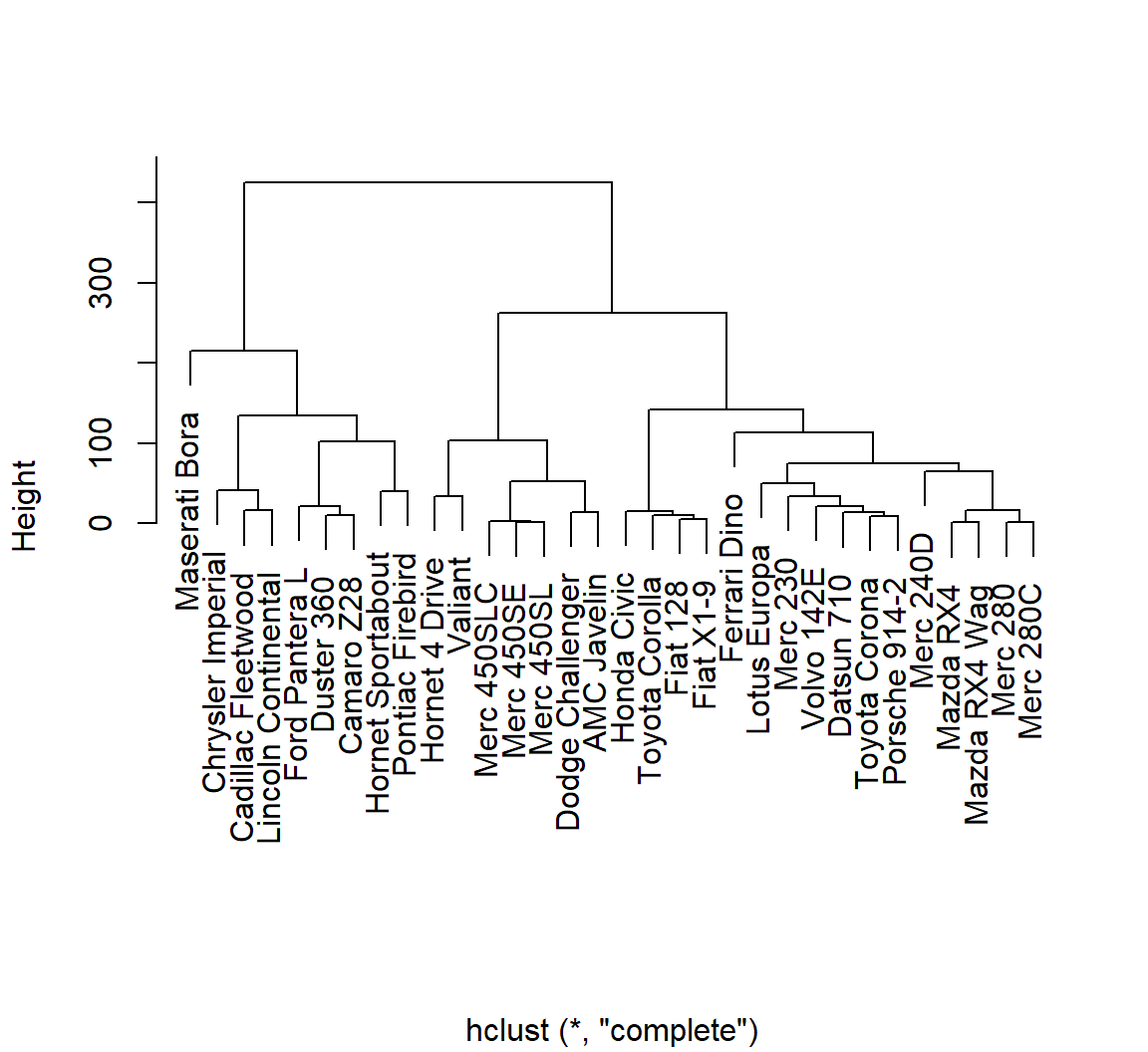
Dendrogram using A2Rplot()
We download the R function from Romain Francois’ (old) website:
source("http://addictedtor.free.fr/packages/A2R/lastVersion/R/code.R")The function A2Rplot() can now be used to draw a colored dendrogram. The argument k specifies the number of clusters that should be distinguished using different colors:
A2Rplot(
  mtcars_hclust,
  k = 3,
  boxes = FALSE)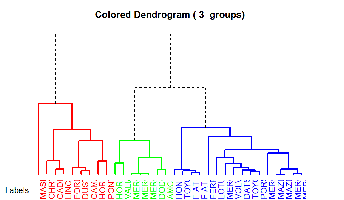
Note how the the colored branches allow us to quickly recognize the degree of dissimilarity among the members of a cluster: The higher the horizontal line joining branches, the greater the dis(!)similarity between the conjoined units. This means that the green cluster is the most homogeneous one.
You can change the colors in the plot using the following arguments:
col.upThe branches above the groupscol.downColors for the groups
The following code backgrounds the branches above the clusters and uses a colorblind-friendly set of hues for the clusters:
A2Rplot(
  mtcars_hclust,
  k = 3,
  boxes = FALSE,
  col.up = "grey",
  col.down = c("#E69F00", "#56B4E9", "#009E73"))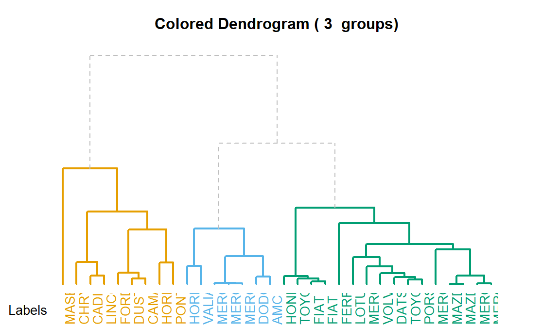
A slightly modified version of the function makes a few minor changes to the appearance of the plot (no title and annotation, thinner branches, more room for labels, avoidance of dashed line patterns). It can be downloaded from my website:
source("https://lsoenning.github.io/posts/2025-06-16_dendrogram_grouping_cues/A2Rplot_modified.R")Here is the resulting alternative version of the dendrogram:
A2Rplot_modified(
  mtcars_hclust,
  k = 3,
  boxes = FALSE,
  col.up = "grey",
  col.down = c("#E69F00", "#56B4E9", "#009E73"))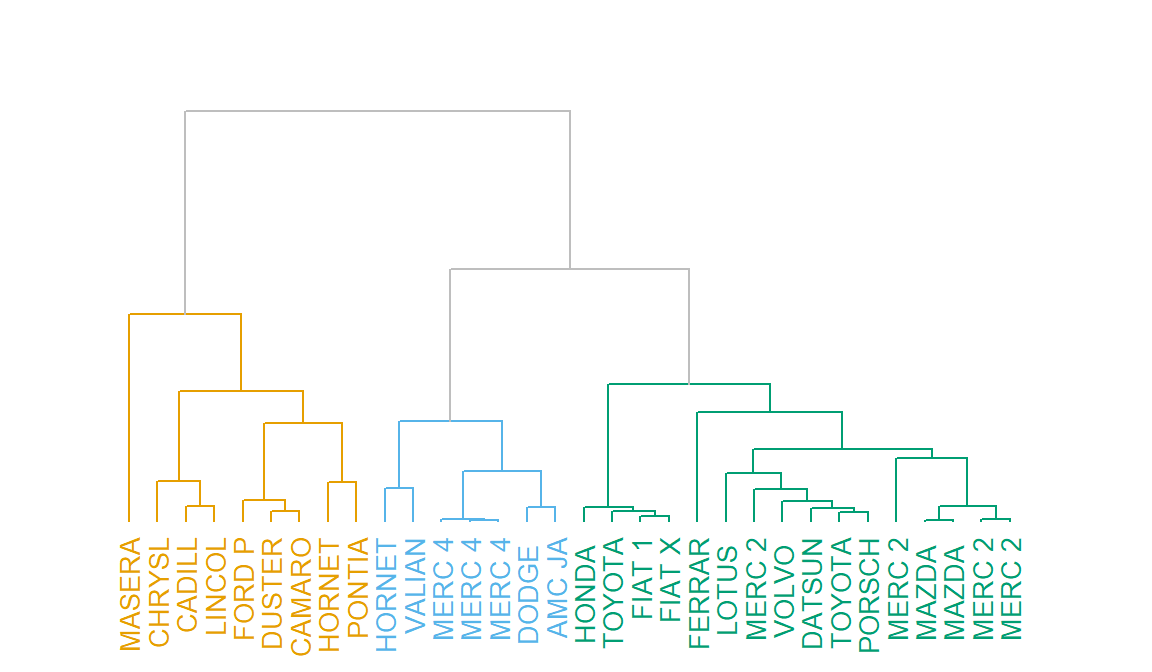
Citation
BibTeX citation:
@online{sönning2025,
  author = {Sönning, Lukas},
  title = {Color-Coded Dendrograms Using the {R} Function {`A2Rplot()`}},
  date = {2025-06-16},
  url = {https://lsoenning.github.io/posts/2025-06-16_dendrogram_grouping_cues/},
  langid = {en}
}
For attribution, please cite this work as:
Sönning, Lukas. 2025. “Color-Coded Dendrograms Using the R
Function `A2Rplot()`.” June 16, 2025. https://lsoenning.github.io/posts/2025-06-16_dendrogram_grouping_cues/.