When it comes to exporting graphs from R, it took me some time to develop a workflow that I am happy with. In this blog post, I provide a brief run-down and illustrate the tools I use. The general steps are the following:
Draw the figure in R, with the result almost looking the way I want it to
Save as a PDF file
If necessary, do some polishing using Adobe Acrobat
If needed, create a PNG/JPG version of the PDF file
R setup
# These packages may need to be installed first:# pak::pak("lsoenning/uls")# pak::pak("lsoenning/wls")library(wls) # for illustrative datalibrary(uls) # for customizing lattice plotslibrary(tidyverse) # for data wrangling and visualizationlibrary(lattice) # for data visualization
Step 1: Draw the figure in R
I almost exclusively use the R packages {lattice}(Sarkar 2008) and {ggplot2}(Wickham 2016) for data visualization. Both generate graphs that are very close to publication quality. Depending on how much extra formatting is needed, it probably makes sense to do parts of the fine-tuning with different software (see below). This is because certain modifications may require pretty involved code. For instance, if I want to italicize a single word in a longer axis title, I don’t do this in R.
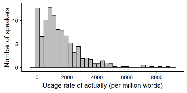
The following code draws a histogram using {ggplot2}. The data show the usage rate of actually (per million words) for speakers in the Spoken BNC2014 (Love et al. 2017). (These data were analyzed in Sönning and Krug 2022; see Sönning and Krug 2021 for details).
data_actually |>ggplot(aes(x = rate_pmw)) +geom_histogram() +xlab("Usage rate of actually (per million words)") +ylab("Number of speakers") +theme_minimal()
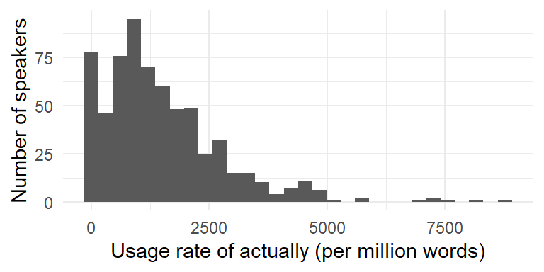
Next, we draw a similar plot using {lattice}:
histogram(~ rate_pmw, data = data_actually, col ="grey",par.settings = lattice_ls,axis = axis_L,nint =35,xlab ="Usage rate of actually (per million words)",ylab ="Number of speakers")
Step 2: Export as PDF
I always save graphs as a PDF – this is for several reasons:
If the figure ends up in a publication, a vector image provides the best resolution. I always forward figures as PDF files to print production.
PDF files require relatively little storage space.
The figure can be polished using graphics software, including Adobe Acrobat.
The function ggsave() makes it very convenient to write images created using {ggplot2} to file. Simply running ggsave() including the storage path saves the file using the current specifications for height and width. These settings can be modified using arguments of the same name. It is good practice to store images in the (manually created) “figures” sub-directory of the project folder.
data_actually |>ggplot(aes(x = rate_pmw)) +geom_histogram() +xlab("Usage rate of actually (per million words)") +ylab("Number of speakers") +theme_minimal()
ggsave("figures/histogram_ggplot.pdf")
Graphs drawn with {lattice} can be saved using the function cairo_pdf(), which works in a similar way. We start by creating a graph object (p1 for plot 1) and then write this object to file. cairo_pdf() opens what is called a “device”, which we need to close afterwards using dev.off():
p1 <-histogram(~ rate_pmw, data = data_actually, col ="grey",par.settings = lattice_ls,axis = axis_L,nint =35,xlab ="Usage rate of actually (per million words)",ylab ="Number of speakers")cairo_pdf("figures/histogram_lattice.pdf", width =4, height =2)p1dev.off()
png
  2
Both PDF files can now be found in the folder “figures”.
Step 3: Polishing in Adobe Acrobat
If I want to add final touches to the image, I use Adobe Acrobat. I am sure there is better software out there, but this alternative is pre-installed on my work laptop and good enough for my purposes. Regardless of the software you use, two things are important:
Before you invest time into fine-tuning, make sure that you are really looking at the final version of the graph. If you decide to alter the figure (or if the data change), you will have to redo all of the manual touches.
Store the modified PDF under a different name – otherwise it may be overwritten when you (accidentally) rerun your code. I always add the suffix “_modified” to the file name, to protect the new version of the PDF file.
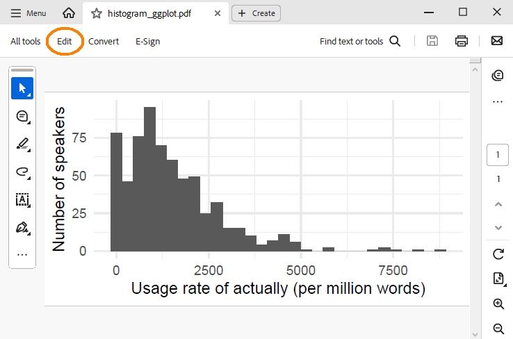
In Adobe Acrobat, click the tab “Edit” to start editing the PDF image:
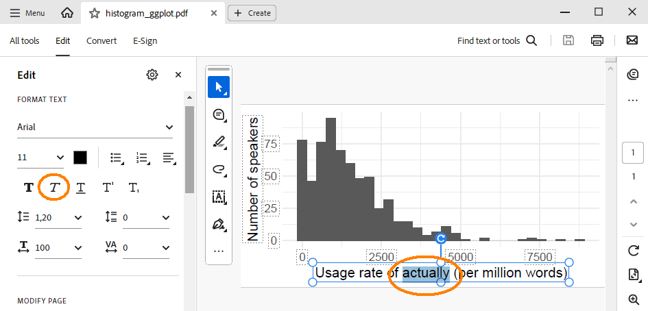
Italicizing the word “actually” in the x-axis title is then pretty straightforward:
There are a few things I sometimes change in PDF images:
Move elements (e.g. text boxes, lines, etc.)
Add annotations in the form of text boxes (this only works by copying an existing text box and then modifying the text)
Change font size and/or color
Crop page to remove white figure margins
Step 4: Create PNG/JPG version if necessary
There are two purposes for which I need raster-based versions of my graphs:
When writing a paper, to include graphs into the Word document, and
for presentation slides (which I create using PowerPoint).
The quick way to get a raster-based version is via a screenshot:
Use the mouse to draw a frame around the part of the screenshot I want to use
Hit Ctrl + C (to copy)
Paste into Word or PowerPoint using Ctrl + V
Alternatively, the PDF file can be properly converted into a PNG file using Adobe Acrobat (All tools > Export a PDF > Image format). The resolution (pixels/inch) can then be specified manually, which is attractive if the PNG file needs to be high(er)-resolution.
References
Love, Robbie, Claire Dembry, Andrew Hardie, Vaclav Brezina, and Tony McEnery. 2017. “The Spoken BNC2014: Designing and Building a Spoken Corpus of Everyday Conversations.”International Journal of Corpus Linguistics, 319–44. https://doi.org/10.1075/ijcl.22.3.02lov.
Sarkar, Deepayan. 2008. Lattice: Multivariate Data Visualization with r. New York: Springer.
Sönning, Lukas, and Manfred Krug. 2021. “Actually in contemporary British speech: Data from the Spoken BNC corpora.” DataverseNO. https://doi.org/10.18710/A3SATC.
———. 2022. “Comparing Study Designs and down-Sampling Strategies in Corpus Analysis: The Importance of Speaker Metadata in the BNCs of 1994 and 2014.” In Data and Methods in Corpus Linguistics, 127–60. Cambridge University Press. https://doi.org/10.1017/9781108589314.006.
Wickham, Hadley. 2016. Ggplot2: Elegant Graphics for Data Analysis. New York: Springer.