
R setup
library(lattice)
library(tidyverse)
library(gamlss)
library(uls) # pak::pak("lsoenning/uls")library(lattice)
library(tidyverse)
library(gamlss)
library(uls) # pak::pak("lsoenning/uls")The negative binomial distribution is a useful device for modeling word counts. A typical setting for its application in corpus linguistics is the modeling of word frequency data – for instance, if we wish to summarize (or compare) occurrence rates of an item in a corpus (or across sub-corpora). Each text then contributes information about the frequency of the item in the form of (i) a token count (the number of times the word occurs in the text) and (ii) a word count (the length of the text). Based on the token and word count we can calculate an occurrence rate (or normalized frequency) for each text, and these rates are then directly comparable across texts.
From a statistical perspective, word frequency would be considered as a count variable, which is observed at the level of the text and can take on non-negative integer values (i.e. 0, 1, 2, 3, 4, …). The text length can be thought of as a period of observation (measured in text time, i.e. the number of running words), in which a tally is kept of the number of events (in this case the occurrence of the focal item). And this is the typical definition of a count variable.
This blog post takes a closer look at the negative binomial distribution – how it works and why it is a useful device for modeling word frequency data. It is helpful to start with a concrete example: the frequency of which in the Brown Corpus. To keep things simple, we will stick to this data setting, where texts have (nearly) the same length. Note, however, that the negative binomial distribution (like the Poisson) readily extends to situations where texts have different lengths.
If we count the number of occurrences of which in each text and then look at the distribution of token counts, we obtain what is referred to as a frequency distribution or a token distribution. The frequency distribution for which in the Brown Corpus, which consists of 500 texts, appears in Figure 1 a. It shows the distribution of token counts across texts: Each bar represents a specific token count, and the height of the bar is proportional to the number of texts that have this many instances of which. Token counts vary between 0 (n = 26 texts) and 40 (1 text), and the distribution is right-skewed, which is quite typical of count variables, since they have a lower bound at 0.
# tdm <- read_tsv("C:/Users/ba4rh5/Work Folders/My Files/R projects/_lsoenning.github.io/posts/2023-11-16_negative_binomial/data/brown_tdm.tsv")
#
# str(tdm)
#
# n_tokens <- tdm[,which(colnames(tdm) == "which")]
#
#
# saveRDS(n_tokens, "C:/Users/ba4rh5/Work Folders/My Files/R projects/_lsoenning.github.io/posts/2023-11-16_negative_binomial/data/frequency_distribution_which_Brown.rds")

n_tokens <- readRDS("C:/Users/ba4rh5/Work Folders/My Files/R projects/_lsoenning.github.io/posts/2023-11-16_negative_binomial/data/frequency_distribution_which_Brown.rds")# Poisson model
m <- glm(n_tokens$which ~ 1, family="poisson")
poisson_mean <- exp(coef(m))
poisson_density <- dpois(0:40, lambda = poisson_mean)
n_texts <- as.integer(table(n_tokens))
token_count <- as.integer(names(table(n_tokens)))
p1 <- xyplot(
n_texts ~ token_count,
par.settings=lattice_ls, axis=axis_L, ylim=c(0, 53), xlim=c(-1.5, NA),
xlab.top = "(a)\n",
scales=list(y=list(at=c(0,20,40,60,80))),
type="h", lwd=6, lineend="butt", col="grey",
xlab = "",
ylab="Observed\nnumber of texts\n",
panel=function(x,y,...){
panel.xyplot(x,y,...)
panel.text(x=30, y=40, label="Observed frequency distribution",
col="grey30", cex=.9)
})
p2 <- xyplot(
n_texts ~ token_count,
par.settings=lattice_ls, axis=axis_L, ylim=c(0, 85), xlim=c(-1.5, NA),
xlab.top = "(b)\n",
scales=list(y=list(at=c(0,20,40,60,80))),
type="h", lwd=6, lineend="butt", col="grey",
xlab = "Number of instances of which",
ylab="Expected\nnumber of texts\n",
panel=function(x,y,...){
panel.points(x=0:40, y=poisson_density*500, pch=19, col=1, cex=.8)
panel.points(x=0:40, y=poisson_density*500, pch=19, col=1, type="h")
panel.text(x=30, y=60, label="Expected frequency distribution\n(Poisson model)",
col="grey30", cex=.9)
})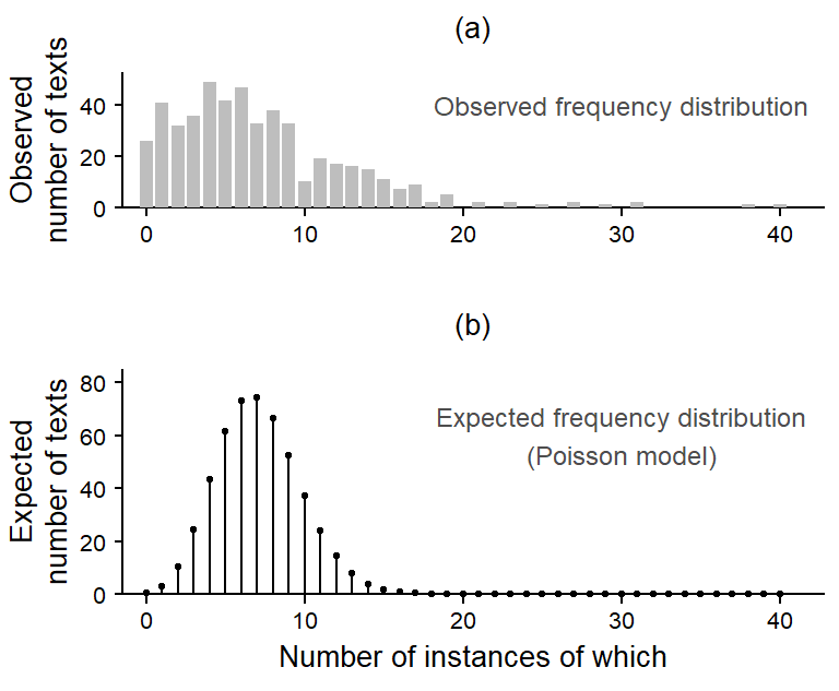
The most basic probability distribution that is available for modeling count variables is the Poisson distribution. In general, we can check the fit of a distribution to the observed token counts by comparing the observed distribution (Figure 1 a) to the one expected under a Poisson model. The expected distribution appears in Figure 1 b. We note a mismatch with the observed data: Its tails are too thin – that is, the observed token counts are more widely spread out; counts of 0 are severely underpredicted (or underrepresented).
In fact, it is often the case that the Poisson distribution offers a poor fit to (language) data. This is because it rests on a simplistic assumption: It assumes that the expected frequency of which (or: the underlying probability of using which) is the same in every text. In our case, where we are dealing with texts of roughly 2,000 words in length, the expected number of instances of which, on average, is 7.1. Due to sampling variation, the actual number of instances per text will vary around this average. This sampling variation is accounted for in the Poisson distribution, giving it the (near-)bell-shaped appearance in Figure 1 b.
In linguistic terms, the model assumes that each text in the Brown Corpus, irrespective of genre or the idiosyncrasies of its author, has the same underlying probability of using which (i.e. about 7 in 2,000; or 3.5 per thousand words). Even for a function word such as which, this assumption seems difficult to defend. For instance, certain genres may use more postmodifying relative clauses, leading to a higher expected rate of which for texts in this category.
To offer a more adequate abstraction (or representation) of the observed token distribution, the assumption of equal rates across texts needs to be relaxed. We want the model to be able to represent variation among texts, and to record the amount of variation suggested by the data. On linguistic grounds, for instance, we would expect function words to vary less from text to text than lexical words, which are more sensitive to register and topic. The idea is to have an additional parameter in the model that acts like a standard deviation, essentially capturing (and measuring) the text-to-text variability in occurrence rates.
It is for this purpose that Poisson mixture distributions were invented. One such mixture distribution is the negative binomial distribution, which is also referred to as a Poisson-gamma mixture distribution. This is actually a more transparent label, as we will see shortly.
The idea behind Poisson mixtures is rather simple. Since the Poisson distribution on its own fails to adequately embrace high and low counts, its mean is allowed to vary. By allowing the Poisson mean to vary, i.e. shift up and down the count scale (or left and right in Figure 1), the probability distribution is more flexible, which allows it to accommodate the tails of the distribution.
Poisson mixtures therefore include an additional dispersion parameter (similar to a standard deviation) and the Poisson mean is replaced by a distribution of Poisson means. Note that the way in which the term “dispersion” is used here differs from the sense it has acquired in lexicography and corpus linguistics (the difference is explained in this blog post).
set.seed(1985)

delta_sample = rGA(20, mu=1, sigma=.1)
lambda_plot = 7
plot1 = xyplot(
  1~1, type="n", xlim=c(0, 20), ylim=c(0,.2),
  par.settings=lattice_ls, axis=axis_L,
  scales=list(y=list(at=0), x=list(at=c(0,5,10,15, 20))),
  ylab="Density", xlab="Frequency",
  panel=function(x,y,...){
    panel.segments(x0=lambda_plot, x1=lambda_plot, y0=0, y1=.19, col="black")
    for(i in 1:length(delta_sample)){
      panel.points(x=0:20, y=dpois(0:20, lambda=lambda_plot*delta_sample[i]),
                   type="l", col="black", alpha=.2)
      panel.points(x=0:20, y=dpois(0:20, lambda=lambda_plot*delta_sample[i]),
                   type="p", col="black", pch=19, alpha=.2)
      }
    })

delta_sample2 = rGA(20, mu=1, sigma=.25)
lambda_plot = 7
plot2 = xyplot(
  1~1, type="n", xlim=c(0, 20), ylim=c(0,.2),
  par.settings=lattice_ls, axis=axis_L,
  scales=list(y=list(at=0), x=list(at=c(0,5,10,15, 20))),
  ylab="Density", xlab="",
  panel=function(x,y,...){
    panel.segments(x0=lambda_plot, x1=lambda_plot, y0=0, y1=.19, col="black")
    panel.text(x=7, y=.22, label="\u03BC = 7", col="black")
    for(i in 1:length(delta_sample2)){
      panel.points(x=0:20, y=dpois(0:20, lambda=lambda_plot*delta_sample2[i]),
                   type="l", col="black", alpha=.2)
      panel.points(x=0:20, y=dpois(0:20, lambda=lambda_plot*delta_sample2[i]),
                   type="p", col="black", pch=19, alpha=.2)
      }
    })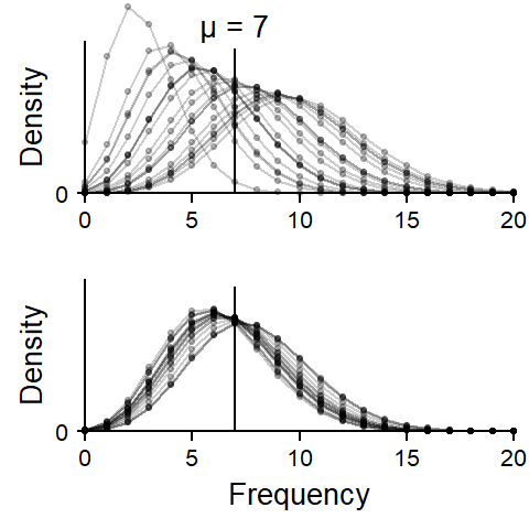
Poisson mixtures can be thought of as consisting of multiple Poisson distributions with different individual means. This is illustrated in Figure 2. To be able to show multiple distributions in one graph, we now leave out the spikes and connect the dots – a single distribution therefore appears as a bell-shaped profile that looks like a pearl necklace. Each panel shows 20 Poisson distributions, and each of these 20 distributions has a different mean. The means vary around 7, the overall mean of the Poisson mixture.
The distributions in the upper panel are spread out more widely than in the lower panel, and it is the newly introduced dispersion parameter that expresses the amount of variation among Poisson means. This basic idea applies to all Poisson mixture distributions. They are called ‘mixture distributions’ because they mix two probability distributions: (i) the familiar Poisson distribution and (ii) an additional probability distribution which describes the variability in the Poisson means. Simplifying slightly, Poisson mixtures only differ in the probability distribution they employ to describe the distribution of the Poisson means.
The negative binomial distribution, for instance, relies on the gamma distribution to describe the text-to-text variability in occurrence rates. It is therefore also called a Poisson-gamma mixture distribution. Figure 3 shows the two gamma distributions that were used to create Figure 2. The dashed curve, which shows greater spread, belongs to the upper panel.
lambda_plot = 7

p1 <- xyplot(
  1~1, type="n", xlim=c(0, 20/7), ylim=c(0,4.5),
  par.settings=lattice_ls, axis=axis_L,
  xlab.top="(a)\n",
  scales=list(y=list(at=0), x=list(at=c(0,.5,1,1.5, 2, 2.5))),
  ylab="Density", xlab="Multiplicative factor",
  panel=function(x,y,...){
    panel.segments(x0=1, x1=1, y0=0, y1=4.5, col=1)
    panel.points(x = seq(.01, 2.8, length=1000),
                 y = dGA(seq(.01, 2.8, length=1000), mu=1, sigma=.1),
                 type="l")
    panel.points(x = seq(.01, 2.8, length=1000),
                 y = dGA(seq(.01, 2.8, length=1000), mu=1, sigma=.25),
                 type="l", lty="23", lineend="square")
    })

p2 <- xyplot(
  1~1, type="n", xlim=c(0, 20), ylim=c(0,4.5),
  par.settings=lattice_ls, axis=axis_L,
  xlab.top="(b)\n",
  scales=list(y=list(at=0), x=list(at=c(0,5,10,15, 20))),
  ylab="Density", xlab=expression("Number of instances of "~italic(which)),
  panel=function(x,y,...){
    panel.segments(x0=7, x1=7, y0=0, y1=4.5, col=1)
    panel.points(x = seq(.01, 2.8, length=1000)*7,
                 y = dGA(seq(.01, 2.8, length=1000), mu=1, sigma=.1),
                 type="l")
    panel.points(x = seq(.01, 2.8, length=1000)*7,
                 y = dGA(seq(.01, 2.8, length=1000), mu=1, sigma=.25),
                 type="l", lty="23", lineend="square")
    })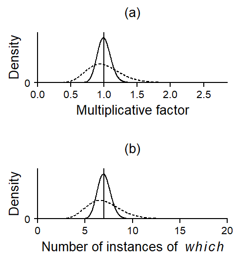
Figure 3 a shows the gamma distributions on their actual scale. These are spread out around a value of 1, because they indicate variability in Poisson means on a multiplicative scale. It makes sense to center the distribution around 1, since the overall occurrence rate (multiplied by 1) should be at the center. The x-axis therefore denotes factors, which means that variability between Poisson means is expressed as ratios. The dashed curve, for instance, ranges from roughly 0.5 to 1.5, which means that most Poisson means are found within ± 50% of the overall mean. Since this multiplicative factor cannot be smaller than 0, we need a probability distribution that is bounded at zero (like the gamma distribution).
Panel (b) translates these distributions to the occurrence rate scale. To create this graph, the factors (i.e. the x-values) in panel (a) were simply multiplied by the overall mean of 7. Now we see that, for the dashed curve, most occurrence rates vary between 4 and 11 instances per text.
Let us now apply the negative binomial distribution to the data for which in the Brown Corpus. We first check the fit of this new model to the data. Figure 4 shows that it provides a much closer approximation to the observed token distribution. It accomodates low and high counts and there seems to be no systematic lack of fit.
m <- gamlss(n_tokens$which ~ 1, family="NBI", trace = FALSE)

nb_density <- dNBI(
  0:40,
  mu = exp(coef(m, what = "mu")),
sigma = exp(coef(m, what = "sigma")))xyplot(
n_texts ~ token_count,
par.settings=lattice_ls, axis=axis_L, ylim=c(0, 77), xlim=c(-1.5, NA),
scales=list(y=list(at=c(0,20,40,60,80))),
type="h", lwd=6, lineend="butt", col="grey",
xlab = expression("Number of instances of "~italic(which)),
ylab="Number of texts",
panel=function(x,y,...){
panel.xyplot(x,y,...)
panel.text(x=10, y=60, label="Poisson",
col="grey30", cex=.9, adj=0)
panel.text(x=20, y=12, label="Negative binomial",
col=1, cex=.9, adj=0)
panel.points(x=0:40, y=poisson_density*500, pch=19, col="grey30", cex=.8)
panel.points(x=0:40, y=poisson_density*500, pch=19, col="grey30", type="l")
panel.points(x=0:40, y=nb_density*500, pch=19, col=1, cex=.8)
panel.points(x=0:40, y=nb_density*500, pch=19, col=1, type="l")
})
Let us consider the gamma distribution that describes the text-to-text variability in occurrence rates. Its density appears in Figure 5, which includes two x-axes: A multiplicative scale (bottom) and a scale showing the expected number of instances in a 2,000-word text (the average text length in Brown). The gamma distribution is centered at 1 (multiplicative scale) and 7.1 occurrences (number of instances of which).
p1 <- xyplot(
  1~1, type="n", xlim=c(0, 21/7), ylim=c(0,1.4),
  par.settings=lattice_ls, axis=axis_L,
  scales=list(y=list(at=0), x=list(at=c(0,.5,1,1.5, 2, 2.5))),
  ylab="Density", xlab="Multiplicative factor",
  panel=function(x,y,...){
    panel.polygon(x = c(seq(.01, 2.8, length=100), (seq(.01, 2.8, length=100))),
                 y = c(dGA(seq(.01, 2.8, length=100), mu=1, sigma=exp(coef(m, what = "sigma"))),
                       rep(0,100)),
                 col="lightgrey", border=F)
    panel.segments(x0=1, x1=1, y0=0, y1=1.4, col=1)

    panel.segments(
      x0 = c(qGA(.25, mu=1, sigma=exp(coef(m, what = "sigma"))),
             qGA(.75, mu=1, sigma=exp(coef(m, what = "sigma")))),
      x1 = c(qGA(.25, mu=1, sigma=exp(coef(m, what = "sigma"))),
             qGA(.75, mu=1, sigma=exp(coef(m, what = "sigma")))),
      y0 = 0, y1 = 1.3,  lwd=2, col=1, lineend="butt", alpha=.5)

    panel.segments(
      x0 = c(qGA(.05, mu=1, sigma=exp(coef(m, what = "sigma"))),
             qGA(.95, mu=1, sigma=exp(coef(m, what = "sigma")))),
      x1 = c(qGA(.05, mu=1, sigma=exp(coef(m, what = "sigma"))),
             qGA(.95, mu=1, sigma=exp(coef(m, what = "sigma")))),
      y0 = 0, y1 = 1.3, lwd=.5, col=1, lineend="butt", alpha=.5)

    panel.points(x = seq(.01, 2.8, length=1000),
                 y = dGA(seq(.01, 2.8, length=1000), mu=1,
                         sigma=exp(coef(m, what = "sigma"))),
                 type="l")

    panel.segments(x0=-.05, x1=21/7, y0=1.3, y1=1.3)
    panel.segments(x0=seq(0,20,5)/exp(coef(m, what = "mu")),
                   x1=seq(0,20,5)/exp(coef(m, what = "mu")), y0=1.3, y1=1.38)

    panel.text(x=seq(0,20,5)/exp(coef(m, what = "mu")), y=1.6,
               label=seq(0,20,5), cex=.8)

    panel.text(x=1.5, y=2, label=expression("Number of instances of "~italic(which)))
    })
The gamma distribution represents a set of values, which specify the deviation of Poisson means from their overall mean in relative terms, as factors. For example, if the gamma distribution is restricted to the range [0.6; 1.7], the Poisson means will vary by a factor of 0.6 to 1.7 around their overall average. For a grand mean of 7, the Poisson means are then spread out between 7 \(\times\) 0.6 = 4.2 and 7 \(\times\) 1.7 = 11.9.
The grey vertical lines facilitate interpretation of the distribution: They show where the middle 50% of the texts (thick lines) and the middle 90% of the texts (thin lines) lie. Thus, half of the texts have an underlying expected number of occurrences between roughly 5 and 9; 90% of texts have expected counts between 2.5 and 14. This gives us a good idea of the underlying text-to-text variation in the Brown Corpus.
To get a better understanding of the negative binomial distribution shown in Figure 4, let us now build one from scratch. Recall that the gamma distribution that is built into the negative binomial model provides us with a set of values with mean 1. We will refer to scores generated from this kind of gamma distribution as \(\delta\) scores. To spread out the Poisson means, the overall mean is multiplied by the \(\delta\) scores drawn from the gamma distribution. Since the \(\delta\) scores are centered at 1, the overall mean is still 7. A gamma distribution that is spread out more widely produces more widely dispersed Poisson means.
Essentially, then, a negative binomial distribution represents a batch of Poisson distributions whose individual means are spread out around the overall mean. This conceptual explanation of the negative binomial distribution illustrates the role of the gamma distribution and its auxiliary parameter \(\phi\). We can translate this illustration into a simple simulation experiment. If we average over a large number of Poisson distributions produced by this procedure, we should arrive at the corresponding negative binomial distribution.
This is illustrated in Figure 6, which was constructed in the following way:
set.seed(1985)

set_nu = 2
delta_s = rGA(1000, mu=1, sigma=sqrt(1/set_nu))

lambda_p = 7
poisson_pool = matrix(NA, nrow=1000, ncol=21)
for (i in 1:1000){
  poisson_pool[i,] = dpois(0:20, lambda=lambda_p*delta_s[i])
}
p1 <- xyplot(
  1~1, type="n", xlim=c(0, 20), ylim=c(0,.45),
  par.settings=lattice_ls, axis=axis_L,
  scales=list(y=list(at=0), x=list(at=c(0,5,10,15, 20))),
  ylab="Density", xlab="Frequency",
  panel=function(x,y){
    panel.segments(x0=lambda_p, x1=lambda_p, y0=0, y1=.25, col="black")
    panel.text(x=7, y=.3, label="\u03BC = 7", col="black")
    for(i in 1:length(delta_s)){
      panel.points(x=0:20, y=dpois(0:20, lambda=lambda_p*delta_s[i]),
                   col="black", type="l", alpha=.03)
      panel.points(x=0:20, y=dpois(0:20, lambda=lambda_p*delta_s[i]),
                   col="black", pch=16, cex=.4, alpha=.03)
      }
    # panel.points(x=0:20, y=colMeans(poisson_pool), type="l", col="white", lwd=4)
    # panel.points(x=0:20, y=dNBI(0:20, mu=lambda_p, sigma=1/set_nu),
    #              type="l", col="white", lwd=4)
    panel.points(x=0:20, y=dNBI(0:20, mu=lambda_p, sigma=1/set_nu),
                 type="l", col="white", lwd=2)
    panel.points(x=0:20, y=colMeans(poisson_pool), type="l", col=1, lty="22", lineend="butt")
    })

print(p1, position=c(0,0,1,.95))
Figure Figure 6 shows the result of this simulation: The actual negative binomial distribution for these data is shown as a white trace, and the results of our simulation, i.e. average probability across the 1,000 simulated Poisson distributions, is shown as a dashed profile. The match is pretty good.
One complication that arises when working with the negative binomial distribution is the fact that it can be written down in two ways. These different parameterizations have consequences for our interpretation of the negative binomial dispersion parameter returned by an analysis. This means that if we are interested in the dispersion parameter, we must know which parameterization our analysis is using. For an overview of which R packages/functions rely on which version of the negative binomial distribution, see this blog post
@online{sönning2023,
  author = {Sönning, Lukas},
  title = {The Negative Binomial Distribution: {A} Visual Explanation},
  date = {2023-12-12},
  url = {https://lsoenning.github.io/posts/2023-11-16_negative_binomial/},
  langid = {en}
}